Remove Background From Image: Seven Creative Cutout Projects to Build
Seven creative directions for one transparent cutout: sticker packs, layered collages, product tiles on brand colour, social overlays, and campaign variants, with the source, refinement, and marketplace rules each one needs.

Most cutout tutorials stop at the download button: background gone, transparent PNG saved, job finished. That is the least interesting part of the work. A clean cutout is not really an output, it is a component — the piece you place on a colour field, inside a collage, over a video frame, or beside six other cutouts in a grid. The creative work starts exactly where the removal ends.
This guide is about that second half. It assumes you can remove background from image files reliably and asks a different question: what is worth building once the subject is free of its original scene? Every direction below is something a designer, a shop owner, or a creator can finish in an afternoon with files they already own.
Why a Clean Cutout Is a Creative Starting Point
Background removal is a segmentation problem: separate the subject from everything behind it while keeping the subject's own detail intact. The output most tools produce is a transparent PNG, which stores an alpha channel alongside colour, so the erased area carries no pixels at all and whatever sits underneath shows through. That single technical property is what makes a cutout reusable. A photo locked in its original frame can only be cropped; a cutout can be composited anywhere.
Modern removal models are genuinely good at this. The BiRefNet line of research, published as a bilateral reference network for high-resolution dichotomous image segmentation, deliberately splits the problem into a localization stage that finds the subject and a reconstruction stage that recovers fine detail, and reports state-of-the-art results against task-specific methods on the standard benchmarks. In daily work you meet that research through hosted endpoints and desktop features: API platforms offer several cutout models behind one interface, and mainstream design tools ship a remove background command of their own.
The practical consequence is that quality differences between tools now show up mostly at the edges — which is precisely where creative work gets noticed.
Seven Creative Directions You Can Build Today
Each direction below starts from one cutout, sometimes the same one repeated.
Sticker packs and chat assets. Cut a subject out, add a thick outline or a soft drop shadow, and export at a small fixed size with generous transparent padding. Six stickers built from six photos of the same pet, product, or person share one visual language for very little labour.
Layered collage portraits. Stack two or three cutouts at different scales over a flat colour or paper-texture field, and let overlapping edges do the work of depth. Cutouts make the overlap possible, because a rectangular photo can never sit convincingly in front of another rectangle.
Product tiles on brand colour. Place one product cutout on a consistent swatch of your brand colour at the same scale and angle across a whole catalogue. The set reads as a designed system instead of a folder of shop photos, and transparency means the colour behind the product is a decision rather than a leftover.
Social overlays and video frames. A cutout with alpha drops cleanly over a video clip or a photographic background, which makes it a usable lower third, reaction graphic, or thumbnail element without masking anything frame by frame.
Print-on-demand and mockups. Where a service expects artwork on a transparent layer, the cutout is the deliverable; the same file also drops into a device, apparel, or packaging mockup without a hard white box around it.
Seasonal and campaign variants. One cutout supports a spring palette, a black-and-white treatment, and a bold poster version, because only the layer underneath the subject changes each time.
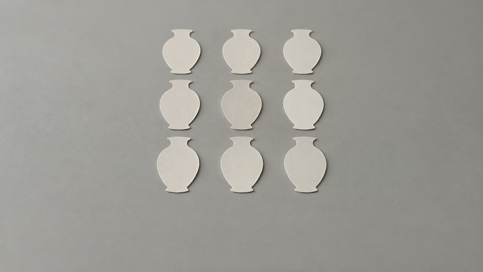
Grids and comparison sheets. Cut the same subject from several shots and lay them out in an even grid at one scale. Differences in pose, colour, or finish that were invisible against different backgrounds become obvious.
Prep the Source Photo Before You Remove the Background
Most disappointing cutouts are an input problem. A subject that is soft, underlit, or almost the same tone as its surroundings gives the model very little to separate. Three conditions do most of the work: the subject is in focus, there is visible contrast between subject and background, and the light is even enough that detail survives at the edges.
Difficult subjects are predictable. Fine hair, fur, feathers, lace, and semi-transparent materials such as glass or chiffon are where every model struggles, because the correct answer is not a binary edge but a partial one. Tools that follow hair and lace acceptably can still leave wispy strands or low-contrast boundaries needing a touch-up, and a more capable model is the usual fix before any manual work. On the KOOX AI background remover, the standard model handles everyday subjects quickly while the BRIA-powered Pro model is the option for hair, fur, jewellery, and semi-transparent details.
If the result will be composited over a dark or strongly coloured field, choose a source where the subject's own edge is not rimmed in a light colour. Bright backlighting is attractive in the original photo and a liability in the cutout, because the glow becomes a fringe you have to remove by hand.
Refine the Cutout So It Looks Intentional
Removal gives you a shape; composition gives you a picture.
Check the edge at full zoom before anything else. A thin bright fringe, sometimes called a halo, is leftover background pixels that survived the mask, and it becomes obvious the moment the subject sits on a dark field. Softening the edge slightly, or cleaning it by hand, fixes most cases.
Then decide what the subject stands on. A cutout placed on a new background without a shadow floats; a subtle contact shadow under the base reattaches it to the surface. Keep that shadow soft and directional, matching the light in the destination scene, and give it less opacity than feels right on your own screen.
Match the light next. If the frame behind the subject is lit from the right, a subject lit from the left reads as pasted even when the edges are perfect. A slight warm or cool shift on the subject, or a gentle shadow down one side, does more for believability than another pass of edge cleanup.
Finally, watch scale consistency across a set. Two products in one creative should share a plausible size relationship, and a repeated motif across a series should hold its proportions.

A Repeatable Cutout Workflow
- Pick the destination before the photo. Decide where the cutout will run — a colour field, a collage, a video frame — because the destination sets the size, the aspect ratio, and whether the transparent edge has to survive export at all.
- Choose a source that gives the model something to work with: sharp, evenly lit, with clear separation between subject and surroundings.
- Remove the background with the fast model, then repeat with the more capable one when hair, fur, or transparency is in frame.
- Export PNG, never JPEG. JPEG has no alpha channel, so a transparent area arrives as solid colour — usually white — and the layer stops working.
- Composite, review at final size, and only then polish. Judging an edge at 400 per cent when it will ship at thumbnail size is wasted effort.
Mistakes That Ruin Creative Cutout Projects
Exporting to JPEG is the most common mistake and the most expensive, because it silently converts a reusable asset into a flattened one. Saving a screenshot of the transparent result causes the same damage, since the screenshot's own background becomes the new background.
The second mistake is trusting the preview. A transparent result shown against white in an editor hides both fringe and lost detail, so check it against a dark swatch and against the actual destination before you approve it.
The third is scaling up. A cutout exported from a small source cannot be enlarged for print or a full-width hero without visible softness, so if a large placement is planned, work from a large source from the start.
The fourth is ignoring the rules of the destination. Marketplaces are the strictest case: an Amazon main image must sit on a pure white background at RGB 255, 255, 255 with no added border or frame, and an image that breaks the rule can be suppressed from search, while alternate images are allowed a neutral or environmental background. Sizing guidance for the same listings clusters around a 1,600 by 1,600 pixel square with the product filling most of the frame. A cutout helps you hit those numbers cleanly, because the subject lands on exactly the background the platform asks for rather than a near-white one.
Where Cutouts Must Stay Honest
Removing a background is a technical edit; it is not permission to change what the image shows. Keep the product, the person, and every claim inside the frame exactly as they were.
Text, logos, and small markings deserve special caution. A cutout does not rewrite lettering, but a composited scene often puts text next to the subject and invites someone to "fix" it; on packaging and labels, work from the real assets instead of recreated ones. And if a cutout of a person is placed in a scene they were never in, the result should be labelled as a composite wherever a viewer could mistake it for a photograph of a real moment.
Reflections and transparent objects need more scrutiny than soft goods do. Glass, watches, and polished metal carry their surroundings in their own pixels, so a cutout that looks clean on a plain field can look hollow against a busy one.
Shipping Your First Cutout Project This Week
Start smaller than feels ambitious. Take one subject you photograph often, remove its background once, and use that single cutout in three places: a colour field for social, a layered composition with a second cutout, and a grid alongside two other shots of the same subject. That exercise reveals which details your source photos are missing far faster than another review round-up will.
Then write down what worked — the source conditions, the model you chose, the field colours, the shadow settings — and reuse it. A cutout library with consistent rules is what turns an occasional trick into a production habit, and the next project becomes assembly rather than experiment.
You can start with one image on the AI background remover, compare the fast and the Pro result side by side, and export a transparent PNG that is ready for any of the directions above.