Selective Color Editing With AI: Six Use Cases for Sellers, Brands, and Creators
Selective color editing with AI changes one object's color while leaving the rest intact. Six concrete use cases for sellers, brands, and creators, with the check each one still needs.

Selective color editing with AI answers one narrow question well: change the color of a single object in a photo without disturbing anything else. Not the overall grade, not the mood, not the skin tone — just the jacket, the kettle, the car, or the packaging. That constraint is what separates a targeted recolor from a global filter, and it is why the same technique shows up in such different rooms: a seller building colorways, a brand rescuing a campaign shot, a creator making one subject pop out of a monochrome frame. Traditional selective color work is well documented — Adobe's guide to replacing object colors has you mask the object, add a Hue/Saturation adjustment layer, hold lightness at zero to keep contrast, and paint the mask by hand to repair the edge. AI recolor keeps that goal and removes most of the manual masking. Below are six use cases for the AI Local Recolor tool on KOOX AI, each paired with the check it still needs before the image ships.
Use Case 1: Turning One Approved Product Photo Into a Colorway Set
The most common reason to reach for selective color editing with AI is also the most commercial: you already have one good product photo and you need more colors. SellerPic's color changer describes exactly this path — create professional color variants from a single product image to expand a catalog without the cost of shooting each color separately. The workflow only makes sense if the recolor preserves the material, so its documentation promises to keep original textures, shadows, highlights, and material properties rather than laying down a flat fill.
Done well, this replaces a repeated task: rebuilding a mask for every draft color. Snappyit's product recolor workflow frames the win the same way, describing a recolor that keeps fabric weave, knit, grain, stitching, folds, and highlights intact so sellers can build consistent catalog variants without reshooting. The check that matters: compare each generated colorway against a real sample, not against the previous generation. A recolor can look convincing in isolation and still be a color you do not actually sell.
Use Case 2: Fixing a Color That Was Wrong at Capture
Not every recolor is creative. Sometimes the product really is the right color and the photo is the problem — a warm cast from a mixed-light room, a navy that photographed as washed-out grey, a red that drifted orange under the venue's lights. Photoroom's Recolor guide lists correcting color and fixing lighting issues alongside brand matching and variation building, and treats them as the same operation: direct the target color, then review the result.
For correction, the discipline is to change as little as possible. Name the object, name the intended color, and add a preservation line so the model holds the texture and the surrounding scene. The check is a side-by-side with the true reference — a swatch, a physical sample, or the original product — because "closer to right" is easy and "correct" is specific.
Use Case 3: Matching a Brand Color Across a Campaign
When one visual runs across a homepage, a paid social set, and a marketplace listing, the accent color has to agree in all of them. Selective color editing with AI gives you a way to pull a single element — a tote, a label, a background prop — toward the brand's color without re-grading the whole frame. This is the "match brand colors" case that Photoroom and SellerPic both name for product imagery.
The honest limit here is worth stating plainly: a color instruction, including an exact hex value, is direction rather than a guarantee that the generated pixels will equal the physical swatch. Nightjar's comparison of color-variant tools makes that point directly — an exact hex value does not promise a pixel-perfect match, and the gap widens for reflective materials, translucent packaging, small logos, patterned fabric, and dark-to-light changes. Treat brand-color work as review-gated: generate, then verify the element at final display size against the approved color.
Use Case 4: A Color Splash for Social and Editorial
The flamboyant end of the technique is the color splash: one subject stays in full color while the rest of the frame falls to black and white. Pixelcut's selective color editor describes the effect as turning an image monochrome while keeping a specific subject in color so it pops, and lists realistic uses such as product photography, portraits, real estate, and social posts that need to stop a scroll. The instruction can be as plain as "keep the flowers pink and make the rest black and white."
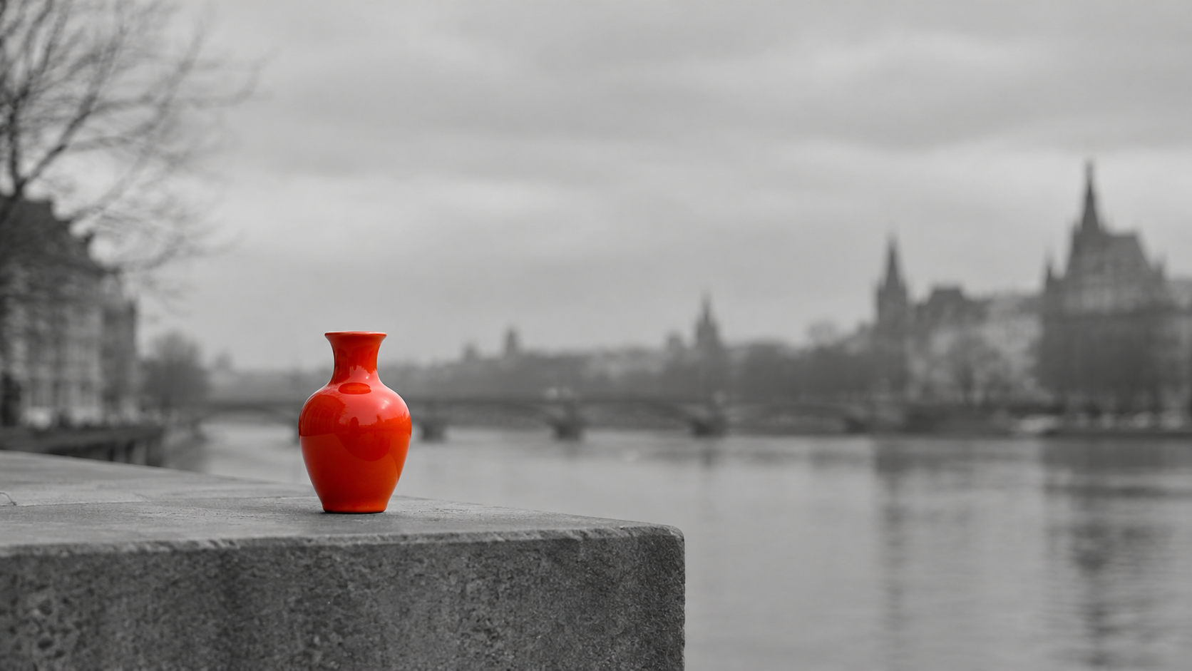
Because this look depends on a clean isolation boundary, it is also the case where sloppy edges are most visible. The check is to zoom to the boundary between color and monochrome and look for halos, stray color on the rim of the subject, or a hard line that does not follow the object's true shape.
Use Case 5: Testing a Seasonal Color Before Manufacturing
Merchandising teams often want to know how a new color reads before anyone commits to producing it. A recolor on an existing photo is a fast way to preview a limited-edition or seasonal direction — Pixelcut and SellerPic both frame recoloring as a way to test a color direction or expand a line, and Nightjar goes further by noting that each approved colorway can become its own reusable product in a catalog system.
The caution is the same one that applies to any pre-production render: a preview image is not a promise about the finished material. Use the recolor to choose a direction and to make the comparison easier, then confirm the final choice against a real sample before it reaches a listing.
Use Case 6: A Smaller Color Fix Inside a Bigger Edit
Selective recolor rarely travels alone. It sits beside the other local edits in a normal retouching pass: removing a distraction, filling a gap, extending a frame, or swapping a background. Adobe's guidance is explicit that the recolored object should keep its contrast and its place in the scene, which is the same instinct behind pairing a recolor with a cleanup step rather than treating the color as a standalone layer. If a stray object sits next to the thing you are recoloring, the natural order is to clean up first with the object remover and then recolor the element you are keeping.
Where AI Recolor Still Needs a Human Check
A short list of honest limits keeps expectations calibrated. Nightjar's write-up warns that every recolored output still needs comparison with the real colorway, and that the risk concentrates in reflective materials, translucent packaging, small logos, patterned fabric, and dark-to-light changes. Photoroom is equally frank in the other direction: its Recolor tool is built for single-color products and may also work for products with white, grey, or black trims, with more complex color schemes still to come. Read together, both sources say the same thing — AI recolor is strong on a defined, single-color target and weaker where the target is ambiguous or the material reflects the light.
A Repeatable Selective Recolor Workflow
Put the use cases in order and a workflow falls out:
- Pick a source where the target object is clear, flat, and unobstructed, and shielded from the shadow of another item — the input conditions several recoloring guides list first.
- Name the object and the target color in the instruction, and add a preservation line for texture, shadows, reflections, and the untouched parts of the scene.
- Generate, then review the result at full size for edge quality, material texture, and any protected detail such as a clasp, a logo, or a rim.
- Compare the color against your real reference, not against the previous attempt.
- Keep the approved version as the base for the next change rather than re-describing the scene, so the comparison stays controlled.

That sequence is deliberately boring, and that is the point: the value of selective color editing with AI is that a single well-specified change is repeatable across a set, and repeatability is what makes a catalog or a campaign look intentional instead of assembled.
Start With the One Object That Matters
Pick a photo you already need — a product, a prop, a portrait — and change exactly one element's color. Specify the object, the color, and what must not change, then check the edge and the texture before you trust the result. Once one recolor behaves, the same instruction structure carries across a whole set, and it pairs cleanly with the neighbouring tools: refine the frame first with image-to-image, recolor the element you are keeping, and keep each approved step as the input to the next.