AI Image Recolor That Holds Up: Prepare, Mark, Describe, Review
A practical AI image recolor routine: prepare the frame, mark one region cleanly, specify colour and finish, then review and refine in controlled passes.
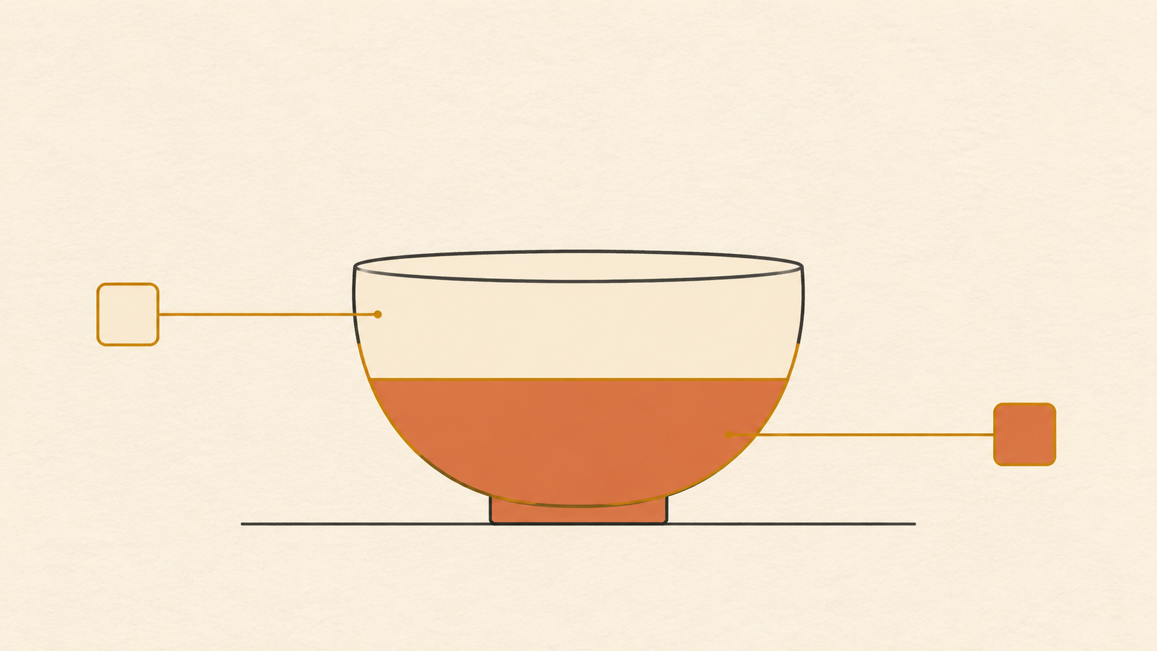
Local recolor looks like the easy half of AI image editing. The picture already exists, the shape already exists, and you only want a different colour in one place. In practice it is the least forgiving job in the toolkit. A global edit can hide its own mistakes behind a new composition. A local one is judged against everything that did not change: the original edges, the original shadow, the original grain all stay exactly where they were and quietly accuse the edited region of being pasted on.
The routine below survives that comparison. It treats AI image recolor as four separate jobs — prepare, mark, describe, review — and gives the last word to a zoomed-in inspection rather than the full-frame glance. Nothing in it depends on a model behaving well on the first attempt.
What local recolor is actually good at
A targeted recolor changes colour or finish inside a selected region while the composition, geometry, and every other part of the frame stay put. That framing tells you which requests are reasonable. Moving a bag from tan to oxblood, knocking a yellow cast off a white wall, giving a matte surface a satin finish, testing whether a jacket works in olive before a shoot — all of these are single-region questions with single-region answers.
What it is not good at is inventing structure. If the new colour is supposed to imply a different material — leather grain, woven thread, brushed metal — the model has to read that texture out of the patch you gave it. When the region is a flat expanse of nearly uniform pixels, there is nothing to read. The result arrives smooth, even, and instantly wrong beside real fabric.
So the first practice is unglamorous: decide whether you are changing a colour or a material. A colour change needs a good mask and a precise description. A material change needs a source region that already carries some of the texture you want to end up with.
Prepare a frame the region can be found in
Masks follow edges, and edges come from contrast. Guidance on local adjustments is consistent here: where a subject separates cleanly from its surroundings, selection is close to automatic, and where it does not, the work moves to the person doing the edit.
Before uploading, look at the boundary of the area you plan to change and count the pixels of ambiguity sitting on it. Three situations are worth fixing at the source rather than in the prompt:
- The region shares a near-identical tone with something behind it, so any mask will grab both.
- A hard shadow crosses the boundary, so half the region already reads as a different colour.
- The region is cut off by the frame edge, so there is no closed contour to follow.
You do not need a studio file. You need a boundary you can describe and a region large enough to judge. Cropping tighter is often the most effective preparation step available: fewer competing objects, a larger region, less distance for the selection to drift.
Mark the region like an editor, not a painter
The mark is the whole edit. Colour comes after; a loose mark cannot be rescued by better wording. Aim for a selection that stops on the boundary instead of near it, and check the two failure modes that the edge controls on any masking tool exist to fix.
The first is overspill: the selection runs past the object and takes a strip of background or a slice of its own shadow with it. That strip gets recoloured too, and because the shadow under an object is exactly where a viewer looks for contact with the ground, the spill reads as a floating object. The second is undershoot: the selection stops short, leaving a thin outline of the original colour around the new one. On a light background it looks like a halo. On a dark one it looks like dirt.
Edge tools map directly onto these two errors. A fit or snap control pulls the boundary onto the real edge nearby, which is what you want around hair, fur, and foliage. A shift control moves the whole edge inward or outward in one step, the fastest fix for a thin halo. Feather softens the transition so the change fades in rather than stopping at a line, and a little is usually enough.
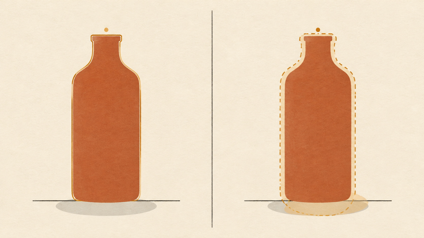
Mark tight, then verify the mark before you describe anything. If the editor shows you the selection as an overlay, look at it against a mid-grey view rather than the photograph: the eye is much better at spotting a wobbling contour when the picture underneath is not competing for attention.
Write the colour as a specification
Colour names are the weakest part of most recolor prompts. "Warm red" covers a range wide enough to contain brick, coral, and oxblood, and a model will pick whichever end of that range looks most attractive. The fix borrowed from product retouching practice is to anchor the request: a hex value, a physical reference, or a swatch image beside the source beats an adjective every time.
Two rules make the specification behave. First, separate correcting from changing. Correcting means removing a cast so the photograph matches the object; changing means making a new colourway. A prompt that asks for both at once gets neither, because the two goals pull white balance in different directions. Second, ban the improvements. Models default to enrichment — more saturation, more contrast, more vibrance — and that default is exactly what makes a recolor unusable for anything that has to match a real product.
Then describe the finish, because finish is what separates a recolor from a fill. Matte, satin, gloss, brushed, chalky, oiled: each implies a different way for light to sit on the surface, and each changes how much of the original highlight survives. A gloss finish needs the existing specular highlight preserved and slightly tinted; a matte finish needs it softened. Ask for one, not for "realistic".
Borrow the light that is already in the scene
The most common reason a clean recolour still looks fake is that the new colour is evenly lit while the scene is not. Real surfaces darken toward the shadow side, pick up bounce from nearby objects, and lose saturation in the deepest tones. A single flat colour across a curved region ignores all three.
Describe the light instead of the average. Naming the direction — lit from the upper left, falling into shadow at the base — and asking for the new colour to follow the existing shading does more than any adjective about realism. Where the surface is glossy, keep the highlight where it is and let the colour shift around it. Where the surface is matte, ask for the shading to stay soft and continuous.
A physical trap sits underneath all of this: the same object photographed under different light sources genuinely appears to be a different colour, so a recolour that matches a swatch on your desk can still look wrong on a warm-toned set.
Review at three distances
Judging a local edit at one zoom level is how small errors survive into publication. Use three, in this order, and stop at the first one that fails.
At fit-to-screen, ask only whether the region belongs. Is the new colour plausible for that object in that scene, or does it pull the eye like a sticker? At actual size, check the boundary. A one-pixel halo is invisible at fit-to-screen and obvious at a hundred percent. At macro, check the interior: grain that continued across the boundary before the edit should still continue, and any texture that went flat in the middle of the region is the model smoothing over a decision it could not make.
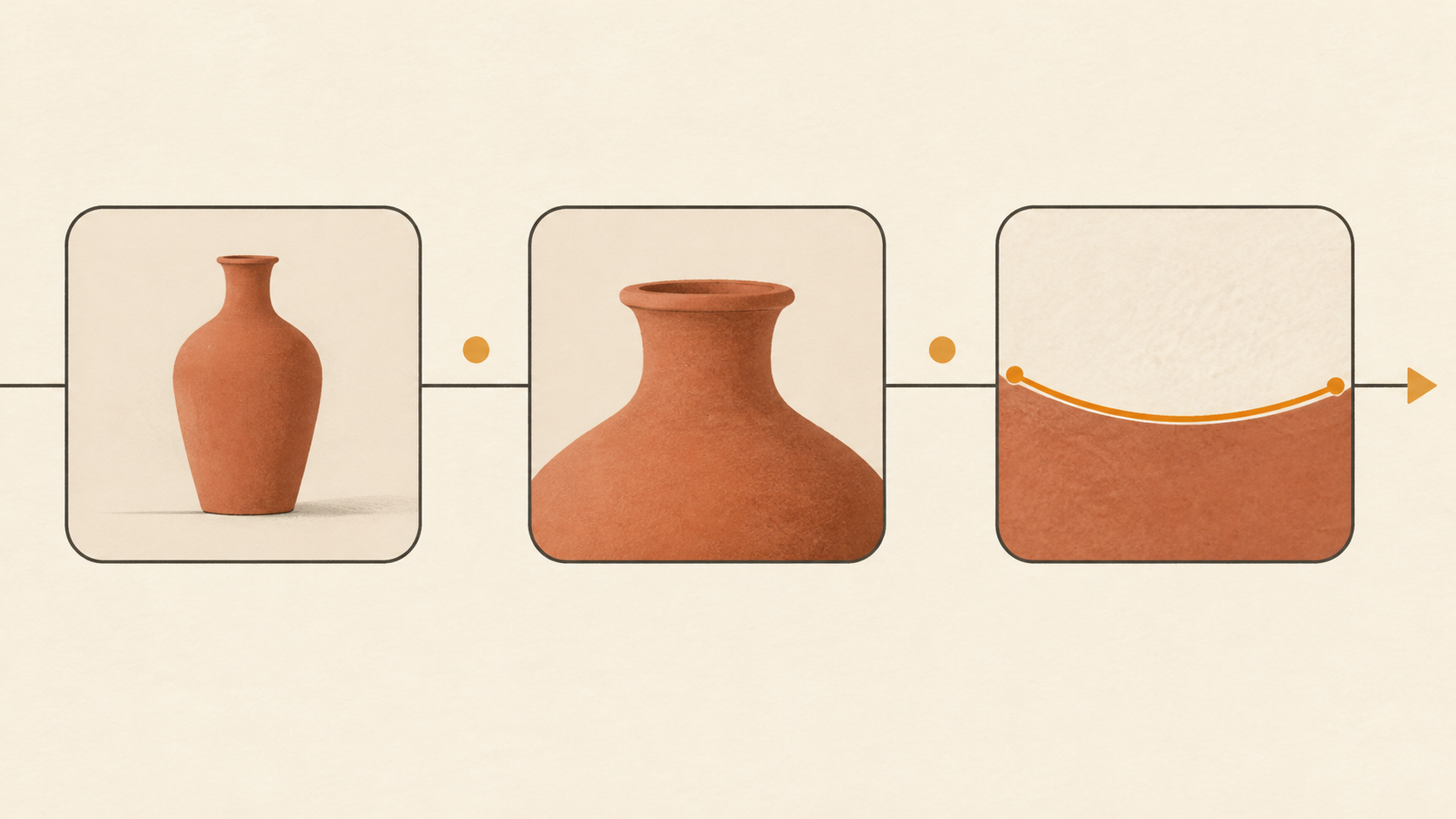
One practical note on the middle step: compare the edited boundary against a boundary elsewhere in the same frame that you did not touch. Your eye calibrates against neighbours far more reliably than against memory.
Refine one variable per pass
Every retry that changes three things at once teaches you nothing, because you cannot tell which change fixed the problem. Keep a short log per attempt: the mark, the colour reference, the finish, the light direction. Change one entry, regenerate, compare the two results side by side. Three or four disciplined passes usually get further than a dozen hopeful ones.
When a result fails, classify the failure before rewriting. Edge failures belong to the mark and are fixed by re-marking, not by rewording; the prompt cannot repair a selection that includes the shadow. Colour failures belong to the specification, and usually mean the anchor was too vague or the improvements were not banned. Texture failures belong to the source region, and no prompt will fix them if the patch was flat to begin with.
When accuracy outranks prettiness
For product work, the order of priorities is different from creative work. Colour is one of the most expensive things to get wrong in commerce, because it is the mistake that comes back as a return: nobody sends an item back over a soft shadow, but plenty send it back when the colour they saw is not the colour that arrived. An edit that looks richer than the original and drifts half a shade off the real product is a defect, not a style choice.
That flips several defaults. Keep a copy of the unedited frame beside the result and compare hue, not mood. Prefer the flatter, more literal result when the two disagree. Note which reference the colour came from, so the next person editing the same product set can match it. And if the brief is a true colourway test for a real product, treat any saturation the model added as something to remove before delivery.
Where the routine should stop
AI local recolor earns its place when the change is one region, the boundary is describable, and the finish can be read from what is already there. It stops earning its place when the region has no usable edge, when the material has to be invented rather than continued, or when the colour has to be certified rather than approximated. Recognising those three cases early saves the most time of any habit in this routine — because the alternative is not a better prompt, it is a different method.
If you want to try the sequence on a real file, the local recolor tool takes an image, a marked region, and a description of the new colour or finish, and keeps the rest of the composition intact at 4K by default. Start with the smallest region in your library that you have always wanted to see in another colour, and judge it at all three distances before you decide the model is the problem.