AI Image Recolor: Seven Creative Directions for One Ordinary Photo
Seven executable creative directions for AI image recolor, each with a shot to make, a palette rule to keep the set coherent, and a review check to run before you commit.
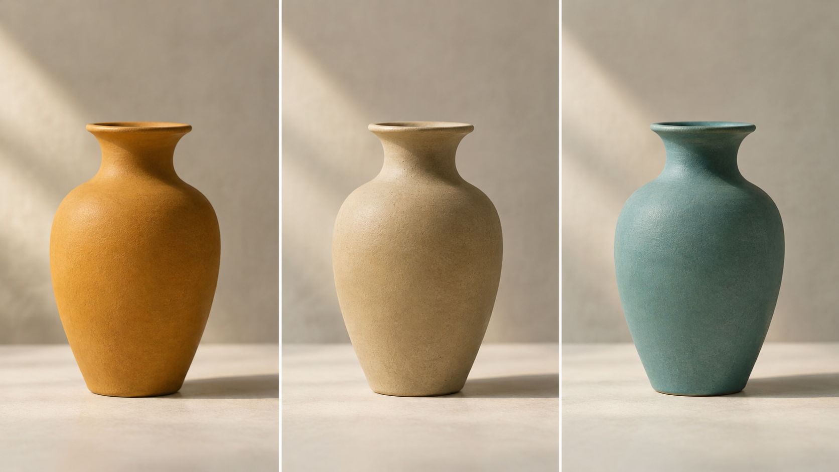
Local recolor is a narrow tool. You point at one region of a photograph, describe a different color, and everything outside that region stays exactly as it was. No relighting, no new set, no reshoot. That narrowness is why it makes a good creative instrument: it forces a decision instead of offering a menu. You are not "editing a photo" so much as choosing what one object in the frame should say, while the rest of the picture keeps its evidence.
The seven directions below are projects, not chores. Each one names the picture to make, the palette rule that keeps it coherent, and the check that tells you whether it worked. All of them run on the same raw material: an ordinary photo you already own, with one object clean enough to isolate. If you want the mechanics of marking a region and revising it rather than ideas, the AI Local Recolor tool is the place to try them.
Direction 1: Swap the mood, keep the frame
Make a triptych from one frame: the same object, the same camera position, three different hues. Because nothing else moves, the hue carries the entire emotional shift. Photography writers describe warm hues, meaning reds, oranges and yellows, as energetic and comforting, and cool hues as calm and introspective, which is why analogous palettes in photography tend to get planned around a mood rather than around a product.
The palette rule here is to pick three hues at roughly the same lightness, so temperature is the only variable. If one panel reads darker than its neighbours, you changed value, and the triptych stops being about mood.
Then check it at thumbnail size, all three in one row. If your eye jumps to a panel because it is brighter rather than because it is warmer, that hue needs another pass.
Direction 2: Steal the palette from the mark
Take two hues that already live in a brand's identity, whether in the logo, the packaging or the signage, and recolor exactly one prop in the frame to the secondary hue. The recolored object then looks like a member of the family rather than an intruder, because the relationship was decided somewhere else and the photograph only has to agree with it.
Use the borrowed hue on the smallest object in the frame and let a neutral dominate everything else. Color harmony guidance is consistent here: in a group of three to five related hues, one color is expected to predominate, and a frame that gives equal weight to everything reads as noise rather than as harmony.
Judge the match in context rather than against a swatch. Color is a perception rather than an absolute property of light, as the Interaction Design Foundation's color theory primer puts it, so an identical hex value can look wrong under a warm window and exactly right under a cool one. Compare inside the photograph, not on a white screen.
Direction 3: Let hue carry the label
Build a grid where the variant is communicated by hue and nothing else: the same still life, one object recolored per panel, no captions anywhere. This has the highest payoff of the seven for a catalogue, a menu or a run of social posts, because the viewer can sort the panels before reading a word.
Stay adjacent on the wheel. Analogous hues, three to five colors sitting side by side, flow into each other and read as one set, so the wider you space them the more each panel turns into its own poster.
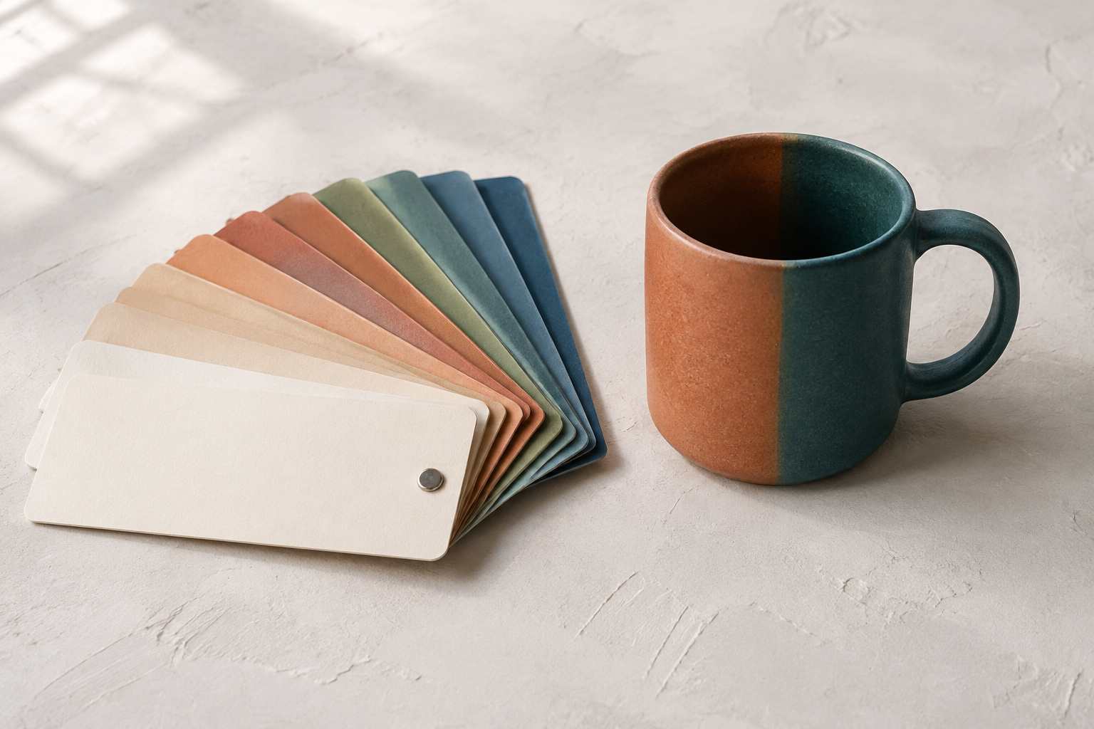
Hand the grid to someone who has not seen your notes and ask them to put the panels in order. If they can find a sequence, hue is doing the labelling. If they cannot, the hues are too close to separate at grid size.
Direction 4: Re-skin a season without a reshoot
One approved base photograph, three accent hues for a campaign calendar. The point is not to invent a product that does not exist. It is to keep a seasonal campaign visually distinct while the underlying shot stays approved, on-brand and recognizably the same picture.
Change hue and saturation together and leave the highlight alone. A material's brightest values come from the light source rather than from the pigment, so a recolored object that keeps its own specular highlight still reads as photographed rather than painted.
To check it, cover the object with your hand and ask whether the rest of the scene still implies one light direction and one color temperature. A recolored region that looks lit from somewhere else will read as a pasted sticker at any size.
Direction 5: The hero in a muted room
The inverse approach: keep the room quiet and push a single object to a saturated hue that sits opposite its surroundings. Complementary pairs are the classic maximum-contrast move, and they hold up because opposing colors give strong separation and visual stability at the same time.
Choose a hue roughly opposite the dominant hue of the room, and keep the room's own palette desaturated. Two saturated colors competing for attention is not a hero shot, it is an argument.
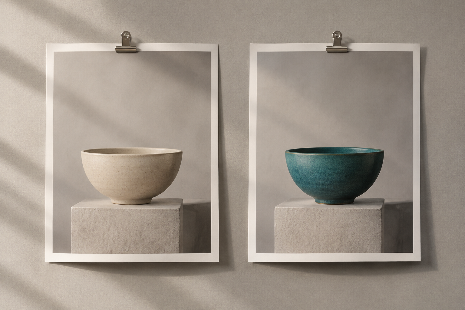
Then look at the frame at postage-stamp size. Whatever your eye finds first should be the object. If it is a wall, a plant or a shadow, the accent is not doing its job.
Direction 6: Keep a color diary
A personal project with a low barrier to entry: photograph the same object, a mug or a jacket or a chair, in different places, and recolor it to a new hue each time. The hue becomes the constant and the location becomes the variable, which is a more interesting series than either element on its own.
Use one hue per frame, and source it from something actually in the scene, a sign, a wall, a passing jacket. Hues that were observed tend to sit better than hues that were assigned, because the scene already contains a little of their light.
After ten frames, lay them out together. A diary should show a rhythm and a few deliberate repeats, not a rainbow. Drop any frame whose hue has no source in the picture, however good it looks alone.
Direction 7: Design the poster around a flat hue
Here the recolor is only step one. Push one object to a flat, saturated hue, then build type and graphic elements around it in your layout tool: two colors plus paper, with the photograph as the anchor.
Use two colors maximum and let the object own the loud one. When the photograph is already flat, every additional color in the layout costs you contrast you cannot get back.
Ask whether the object still looks photographed rather than illustrated. A flat hue survives on a real object only if shading, edge detail and texture survive with it. If the region went smooth and plasticky, pull the saturation back until the material returns.
The four rules that keep a creative hue believable
Whatever direction you pick, the same craft rules decide whether the result reads as a choice or as a mistake.
Value comes before hue. Lightness is what carries contrast and legibility, while hue and saturation contribute comparatively little, which is exactly why the W3C's contrast guidance calculates contrast from relative luminance rather than from color. Keep a recolored region near its original value and it sits in the scene. Change the value sharply and you have relit the object rather than recolored it.
Borrow the light that is already there. A region beside a warm window should pick up some of that warmth, and a region in shadow should not end up the brightest thing in the frame.
Work one region per pass. Instruction-driven editing behaves best as a conversation with a single change at a time, which is how the Gemini image documentation describes multi-turn editing, so resist fixing the hue, the shadow and the edge in one sentence.
Keep the evidence: texture, weave, grain, brushed metal, dust. A region that lost its micro-detail is the most common tell in a recolored photograph, and no amount of matching hue repairs it.
Write the color as a specification, not a mood word
Moody and premium are not colors. Hue tells you which color it is, value tells you how light or dark it is, and saturation tells you how pure or greyed it is, and those three attributes are what make a hue reproducible. Write all three, then add one reference object so the instruction has a target: a deeper, less saturated teal with a matte finish, like a jade tile in daylight. That travels better than any adjective you can invent.
A twenty-minute test before you commit to a series
Make the hardest frame first. If the object has a reflective edge, a transparent panel or skin nearby, that is the frame that will fail, and it is much cheaper to find out now than after eleven variants.
Then look at the result three ways: at thumbnail size, at full size, and next to the untouched original. The thumbnail tells you whether the hue separates. Full size tells you whether the texture survived. The side-by-side tells you whether you improved the picture or merely changed it.
Last, write the instruction down exactly as you used it. A direction you cannot repeat is a lucky accident, and a series needs a recipe rather than an accident.
Where the creative license has to stop
Recolor is a styling tool, not a truth tool. Do not turn a product into a colorway that does not exist if the image is being used to sell it, do not change the apparent material of something a buyer will hold in their hands, and leave regulated labels, safety marks and printed text on packaging alone, because the edges of lettering are the first thing to smear. Skin, eyes and anything a viewer will read as a factual claim about a person belong to a different and more careful conversation.
Everything else in the frame is yours. Pick one direction, choose one frame, and let a single hue do the work that a whole production used to.