Creative AI Image to Image Ideas: Eight Directions for One Photo
Eight creative AI image to image directions you can run from one photograph, with the change to ask for and the details to protect in each edit.
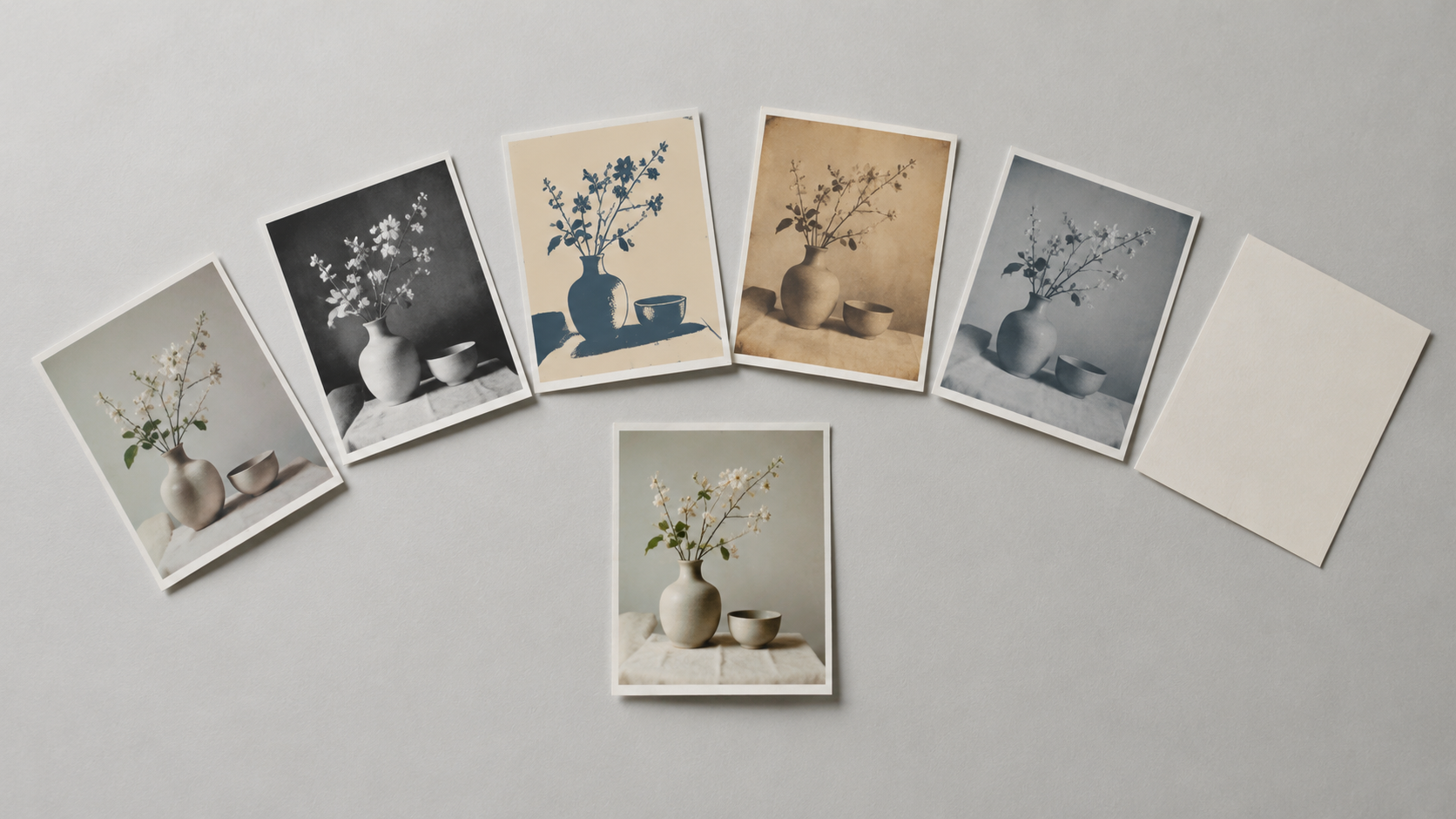
Image-to-image editing has an unusual failure mode: the technology is rarely the limit, the direction is. You open a tool with a photograph you already like, and because nothing asks what you want the picture to become, you either repeat last week's restyle or accept a result that looks like a filter with extra steps. Editing images with AI prompts rewards preparation that happens before you touch the prompt box: deciding the destination, then naming what must survive the trip.
Scenario's documentation is blunt about where quality comes from — the reference image you provide, the clarity and specificity of your instructions, and the model you choose (Scenario, edit with prompts). The eight directions below stay inside that triangle. Each names a single change, the details that have to survive it, and why the result is worth keeping, all from one source photograph and without a studio or a second image library.
What Makes a Creative Direction Work in Image-to-Image
Two conditions separate an idea that produces a usable picture from one that produces a curiosity.
The first is that the source must contain what the destination needs. Starting from an existing photo or sketch and describing the transformation gives you more control over composition than building from a blank prompt, because the subject, framing and light are already decided (Runway, how to make AI images). A snapshot with a clean subject and a boring background is therefore a better starting point than an elaborate picture with a busy one; if what you want to transform is not clearly visible in the source, no wording will rescue it.
The second is that every direction is one change plus an explicit list of invariants. For most image-to-image edits a four-part structure holds up: identify what should change, describe the replacement, state what must remain unchanged, and describe the visual quality of the finished photograph (GenImagePro, AI photo editing prompts). Adobe's editor walkthrough shows how that reads in practice — one prompt changes the colour of the third vase, another adds a wallpaper, another puts hydrangeas in the fourth vase, each naming a single target in everyday language (Adobe, edit an image using text).
Creative directions fail when they smuggle three changes into one sentence. "Make it cinematic, winter, and shot on film" asks for new light, a new environment and new surface texture at once, and all three suffer. Run them as passes instead: weather first, grade second, grain third.
Write Each Direction as Two Sentences
The prompt does not need to be long; it needs to be complete, and two sentences usually are.
Sentence one describes the destination: the change you want and how the finished picture should look. Sentence two protects the source: the identity, geometry, label, pose or light direction that must not move, plus one cue for how the new pixels should sit against the old ones, such as matching shadow softness, reflections or grain.
Vagueness is the other common failure. Instructions such as "make it professional" or "improve this image" hand every decision back to the model, while concrete material and lighting terms keep those decisions with you (GenImagePro). Order matters too: image models tend to weight earlier words more heavily, so the subject and framing instruction belong at the front rather than buried at the end (Runway).
The model is the third lever. Scenario's notes describe the range — one model is stronger on text-heavy layouts and multi-turn consistency, another on realistic faces and multi-reference prompting, a third chosen to minimise style drift away from the original (Scenario). If a direction keeps failing while the prompt reads clean, change the model before rewriting the sentence.
Eight Directions You Can Run From One Photo
The order is deliberate: the first three ask the least of the source, the last few ask the most.
1. The style ladder. Choose three sympathetic looks for the same photo — a soft editorial colour grade, a high-contrast monochrome, a restrained two-colour screen print — run each as its own pass, and keep the set. Composition and crop stay identical across all three, which is what makes them usable as a series rather than as three unrelated pictures. Prompt line: "Render this photograph as a two-colour screen print in warm red and ink blue, keeping the framing, subject position and expression unchanged, with paper texture visible in the flat areas."
2. The decade shift. Restyle a portrait or street frame into a specific past era. This is the direction that punishes careless preservation, because small changes to the eyes, nose, lips, jaw or skin tone can make a real person look like someone else, so state identity preservation explicitly (GenImagePro). Keep it to one era per pass and check the face at full size afterwards.
3. The weather and season swap. Put an outdoor shot into different light so one frame covers the whole year. The trap is a background that ignores the original capture: a replacement environment has to agree with the camera perspective, the light direction and the contact shadows (GenImagePro). Ask for the new weather and the matching shadows in the same sentence, and keep the subject's own lighting intact.
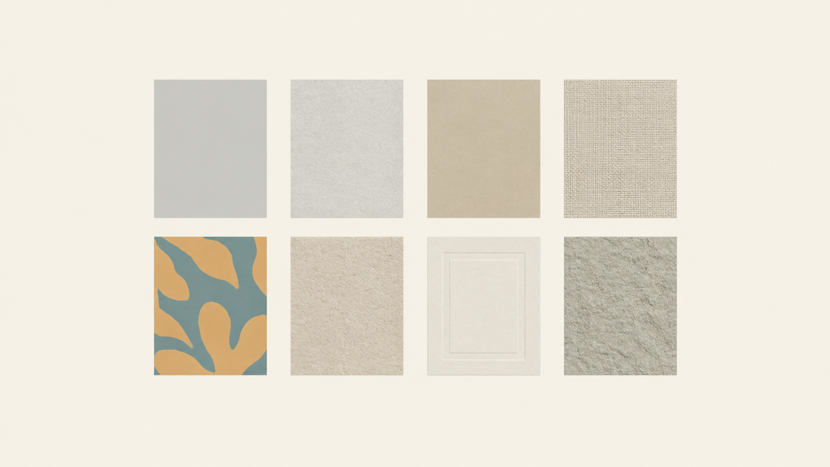
4. The material study. Re-render one element of a product or object in a different material — glazed ceramic, brushed aluminium, woven textile, raw plaster — while the silhouette, scale and framing stay put. Designers use this to test a direction before anything is manufactured, and the preservation instruction carries the weight: name the exact geometry, packaging, label and colours that must not change (GenImagePro).
5. The miniature. Rebuild a familiar scene at toy scale: a diorama base, softened shadows, a shallow plane of focus. What sells the illusion is not the blur but the physics, so keep the subject's pose and the camera angle from the original and let the prompt supply only the scale cues and the surfaces.
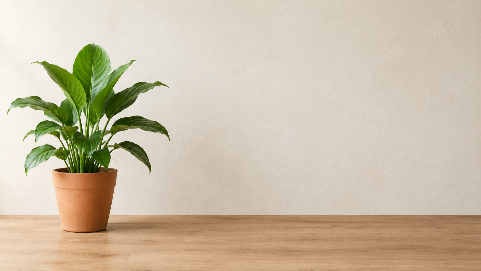
6. The poster with space for type. Ask for one change that creates a blank region for a headline, then set the type in your layout tool. Adobe's example does the same thing with a wall — a single prompt adds a wallpaper while the furniture stays where it was (Adobe). Space for website text is a legitimate first-class edit rather than a compromise (GenImagePro), and the words belong in the layout tool because accurate text rendering is still one of the least predictable parts of image generation (Runway).
7. The composite. Bring a second image in: the subject from one photo placed into the scene of another, or a reference uploaded for style only. Adobe treats this as a first-class control — reference or subject images keep a specific subject consistent or shape the overall look (Adobe) — and Scenario documents multi-reference prompting across several models, some of them supporting a larger reference set (Scenario). Support varies by tool, so check yours before planning a four-image composite.
8. The sketch that becomes a render. Sometimes the fastest way to explain a layout is to draw it. OpenAI's Images 2.5 introduced Sketch, which takes a rough hand-drawn layout as a visual guide and completes it from a description of the style and details you want (OpenAI, Images 2.5). It is the same guide-plus-prompt logic that makes image-to-image more controllable than a text-only prompt, applied to a drawing instead of a photograph.
Run Them as a Week, Not Eight One-Offs
Eight directions tested at random produce eight loose files. Run in sequence, the same eight produce a small body of work with a coherent look.
Start with the style ladder, because it asks the least of the source and tells you immediately whether the photo is worth building on. Move next to the weather and decade passes, which rewrite light and era but keep the frame. Leave the composite and the miniature for last: they change the scene most, and by then you will know which details matter to you.
Two habits keep the sequence productive. Refine the near miss instead of restarting — if a result is close, edit the one element that is off rather than regenerating from a new prompt (Runway). And keep the prompt text for anything that worked, because a line that solved a revision on one photo is a reusable preset on the next.
Consistency across a series is improving on the model side too: OpenAI describes its newer image model as following editing instructions more reliably across multiple turns, with earlier changes more likely to hold as the work grows (OpenAI) — precisely the property a series needs.
Protect the Details That Make the Photo Yours
Every direction above gets safer with one habit: write the preservation list before the change list. For product work that list carries the geometry, packaging, label, logo, colours and materials, because a beautiful campaign image is worthless if the bottle changed shape along the way (GenImagePro). For people it carries the face. For interiors and architecture it carries the camera position and the light direction.
When the target is genuinely narrow, say so: asking for everything unrelated to stay unchanged, or selecting the specific area when the tool supports it, both narrow the blast radius of an edit (GenImagePro). If a direction keeps leaking into regions you never mentioned, reduce the scope of the pass instead of adding prohibitions.
Limits Worth Respecting
Three limits keep a creative catalogue honest. Wording does not transfer cleanly between tools, so a direction that works in one generator is not a guarantee in the next. Commercial terms vary by platform and sometimes by plan, and each generator sets its own, so check the terms of the tool you actually used before an image goes into commercial work — using someone else's image, video or audio without permission is prohibited on at least one major platform (Runway). And disclosure is partly yours to manage: if a restyled portrait, a fabricated location or a composited scene could be mistaken for a record of something real, label it.
Pick One Direction and Finish It Today
The creative work in image-to-image is not finding a clever phrase. It is choosing a destination the source can actually reach, describing it in one sentence, protecting everything else in the second, and reviewing at full size instead of in a thumbnail.
Open the KOOX AI image to image tool, load one photograph you have the rights to use, and run the style ladder first: three passes, one change each, same crop throughout. When a single region is the whole job, hand it to a narrower tool instead — generative fill to repair or extend one area, an object remover to take out a distraction, local recolor when only a colour should move, and an image expander when the frame itself has to change. One source photo, one direction, finished — a better afternoon than eight unfinished experiments.