Create Cartoon Art With AI: Seven Prompt Patterns You Can Reuse
Seven reusable prompt patterns for creating cartoon art with AI, from a five-layer style line to a palette budget that keeps one look consistent across a whole series.
Creating cartoon art with AI rarely fails because the model cannot draw. It fails because the prompt never decided what kind of drawing it wanted. Type "cute cartoon style" and you have described a mood, not an instruction. Run that prompt three times and you will meet three characters who look as though three different illustrators drew them.
A cartoon look is a system, not an adjective. Line quality, shape language, palette, shading and framing are separate decisions, and each one is something a prompt either sets deliberately or leaves to chance. Write them down once and you can reuse them across a series, keep a character recognisable between scenes, and repair a weak result by turning a single dial.
The seven patterns below follow the order a real project takes: fix the style, lock the character, budget the colour, stage the action, frame the shot, revise one variable at a time, and only then reach for a reference photo. Each comes with a template and a note on when to change it.
Why Vague Style Words Fail
Image models do not understand art history. They match statistical patterns, and style words steer those patterns. The words that work reliably describe how an image is made rather than how it feels.
Four families of pattern are steerable. Medium patterns cover how a material behaves, such as watercolour bleeds or ink jitter. Rendering patterns cover light and shadow: flat cel shading, soft gradients, crosshatching. Design language covers shape and proportion conventions, which is why hard angles read as edgy and large rounded eyes read as cute. Camera conventions cover the photographic layer: rim light, film grain.
The distinction worth internalising is that many popular "style" labels are not styles at all. Watercolour is a medium, and loose botanical watercolour looks nothing like opaque storybook watercolour. Portrait and fantasy are genres: they describe what is in the picture, not how it is drawn. A style is the whole set of decisions working together.
For cartoon work specifically, six levers shape the result: linework, shapes and proportions, colour palette, shading and lighting, texture and detail, and background design. Bold outlines give a graphic, printed feel while softer lines read hand-drawn, and flat shading reads as classic animation while modelled shadow reads as dimensional. That list is your checklist.
Pattern 1: Write the Style as Five Layers
Instead of hunting for a name that sums up the look you want, fill five positions in a fixed order. The order matters because it moves from the coarse decision to the fine one.
| Layer | What to name | Example |
|---|---|---|
| Format | the kind of artefact | illustration, comic panel, sticker, character sheet |
| Medium | the material behaviour | matte gouache, ink and wash, flat vector, clay, pixel art |
| Linework | the edge treatment | thick uniform outline, tapered ink contour, lineless |
| Shading | the light model | flat colour, one soft shadow, cel shading, crosshatching |
| Palette | the colour budget | five-colour warm, muted earth, three-colour risograph |
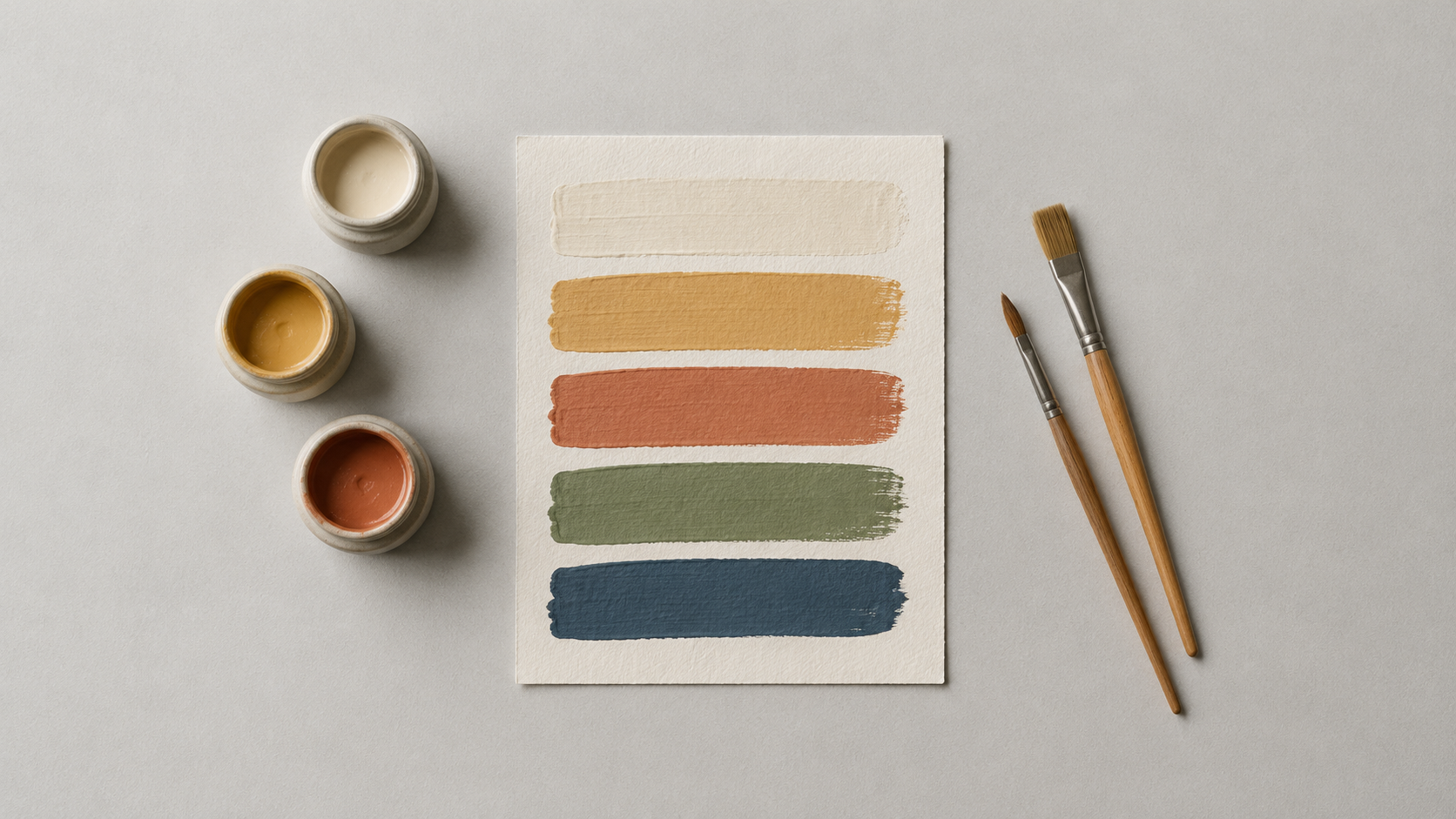
A completed style line looks like this: "2D storybook cartoon, matte gouache with visible brush edges, confident tapered ink contours, flat colour with one soft shadow, warm five-colour palette of cream, ochre, terracotta, olive and ink blue."
Why it works: every position you leave empty is a decision the model makes for you, and it will not make the same one twice. The second benefit is editability. To test a variant, change one layer and leave the other four alone, and style exploration becomes a comparison instead of a lottery.
Store the style line in a notes file and paste it into every prompt in the series.
Pattern 2: Lock the Silhouette Before You Decorate
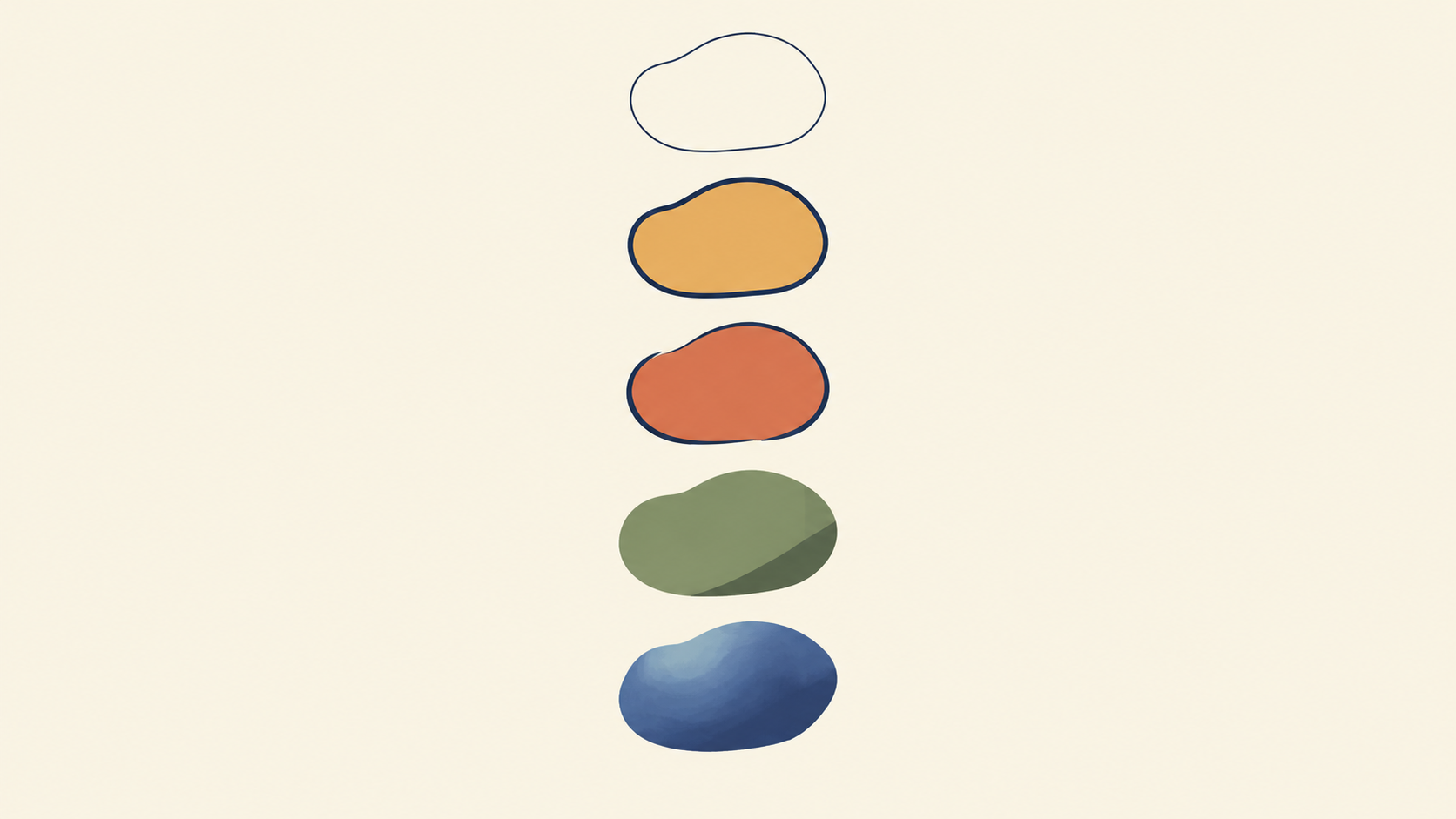
Readers recognise a character at thumbnail distance through body proportion, hair mass, outer garment and one signature object, which is the order the eye reads and therefore the order to write identity in.
Pick one or two strong silhouette decisions rather than twelve equally loud accessories: a triangular cape over a narrow body, oversized circular sleeves above compact boots, a long coat split around a rigid equipment pack. Then write an identity block you will reuse word for word.
"Compact rounded body, oversized head, one curved tuft of hair sweeping left, mustard work apron over a cream shirt, wooden spoon tucked into the front pocket, scuffed ankle boots."
Faces need structural language, not praise: face shape, eye shape and spacing, eyebrow weight, nose treatment, mouth shape, apparent age, and any distinguishing mark with its exact position. "Beautiful", "cool" and "highly detailed" establish nothing, because they describe your reaction instead of the drawing.
Accessories are cheap to add and expensive to remember. A prompt that names one signature object, one garment shape and one hair mass keeps the character recognisable in the next scene, and the freed attention goes into the expression.
Pattern 3: Give the Palette a Budget
Colour drift is the most visible kind of inconsistency in a series, and it usually starts with one word: colourful. That word hands the model permission to distribute attention everywhere, so faces, background clutter and props compete at the same volume.
Replace it with three roles. Name a dominant colour, a secondary colour, and an accent, then say exactly where the accent is allowed to appear.
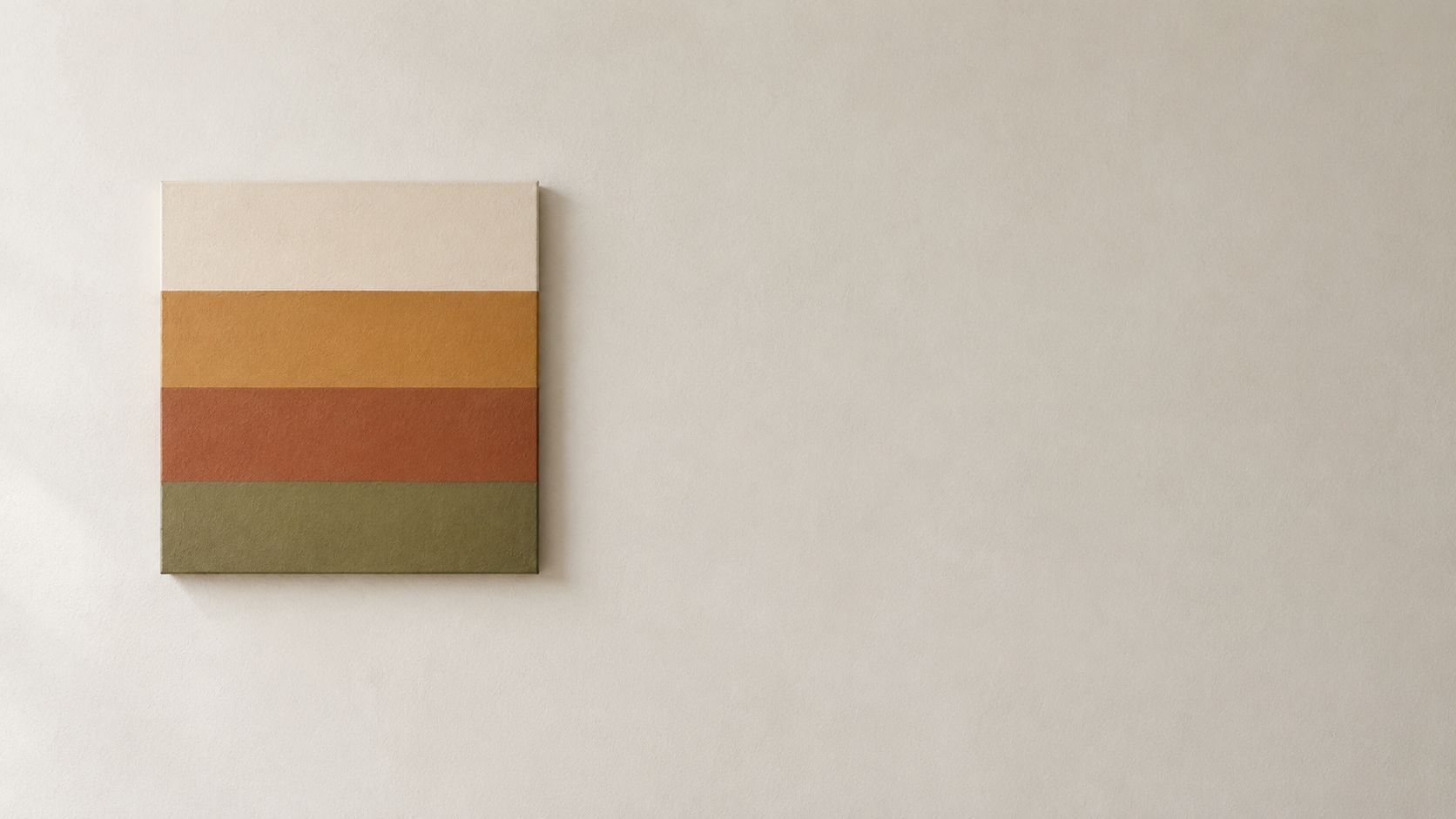
"Dominant warm cream, secondary dusty indigo, accents in tomato red used only on the scarf, the shoe soles and the mug."
The accent clause does the work of five style adjectives. It says which small areas pull the eye and keeps every other surface inside two colours. When a result feels busy, the fix is usually a palette budget, not a new prompt.
Keep your composition and identity blocks and replace only the palette sentence: one series becomes a campaign in a second colourway without redrawing anything.
Pattern 4: Separate Acting from Rendering
The most common cause of a drifting series is that identity, action and camera treatment are mixed into one uncontrolled paragraph. Split them and the prompt becomes editable at the seams.
An acting line says what is happening and how the character feels: "sitting cross-legged on a stack of books in a sunlit window seat, chin propped on one hand, trying not to look bored."
A rendering line says how the viewer sees it: "medium-wide eye-level shot, character on the left third, warm window light from behind, plain cream wall, flat colour with one soft shadow, warm five-colour palette."
Because the two lines are separate, you can keep the rendering line identical across twenty prompts and change only the acting line. The scenes move while the look stays put. It also shortens the revision cycle: if the mood is wrong, you edit one sentence, not the whole prompt.
Pattern 5: Frame the Shot Like a Storyboard
Shot size is the sentence structure of a story. Extreme wide establishes the world and its scale. Wide shows body action and geography. Medium carries gesture and relationships. Close-up delivers a reaction or a decision. Insert supplies object information.
Angles work the same way. Eye level is neutral observation, low angle adds authority or threat, high angle adds vulnerability, and an over-the-shoulder view creates point of view.
Name one shot size and one angle in every prompt, then keep the rendering line fixed. A medium shot and a close-up from the same series will still look related, because only the framing moved. Vague framing is what makes a set of images read as unrelated posters.
Pattern 6: Revise One Layer per Pass
When a result misses, the useful question is not how to improve the prompt but which layer failed. Character drifted between scenes? That is pattern 2, identity. Colours muddy and attention scattered? Pattern 3, palette. The image reads as a poster when you wanted a comic panel? Pattern 1, format. Action unclear? Pattern 4. Composition dull? Pattern 5.
Keep one approved image as an anchor and compare each new result against it before you compare it against your idea of the image. Then change one variable and keep everything else identical, so you learn something from every attempt.
Some cartoon directions hold together more easily than others. Flat vector and clean line art drift least, because fixed rules and flat fills leave little room to wander. Bold-outline cartoon, cel-shaded 2D and pixel art sit just above: lock the outline weight and the palette. Watercolour storybook looks, collage and anime drift more, because edges and textures wander. Painterly work and claymation finishes drift most, which suits one hero image better than a forty-piece series.
Prompt length matters less than structure. A focused eighty to one hundred and eighty words gives more control than a page of repeated adjectives, because repetition makes every instruction equally important, and importance is what you are trying to establish.
Pattern 7: Let a Reference Image Control One Property
When you supply a reference, say which property it guides: identity, pose, costume, composition or style. A single reference cannot control all five at once, and prompts that assume otherwise produce a blend of none of them. One reference for the design, a second for the pose if you need it, and let the text carry the treatment.
Use only images you have the right to use, and get permission before restyling a photograph of someone else. Rather than asking for the exact imitation of a living artist's work, describe the visual facts you want: medium, line, shape, shading and palette. It is more precise and more repeatable.
Putting the Patterns to Work
A working order that survives a deadline: write the five-layer style line once, lock one identity block, draft two or three palette budgets, generate one anchor image you are happy with, then build the series by changing only the acting line and the shot size. Most people run this backwards, generating a dozen finished prompts before deciding what the look is.
The same patterns cover the common projects. A brand mascot needs pattern 2 above all, because the shape has to survive being redrawn at twenty pixels. Thumbnails live on pattern 5: the shot has to read at postage-stamp size. Social posts are where pattern 3 pays off, because a series sitting next to itself in a feed is judged on colour before content.
Start with a text prompt in the AI cartoon generator, and when the artwork has to be based on a real subject, bring a photograph into image to image. Both take a written prompt, so the style line you built above carries over unchanged; only the input differs.
One habit is worth more than all seven patterns: keep a plain text file of the sentences you reuse. Style line, identity block, palette budgets, rendering line. A series is not twenty prompts, it is four sentences applied twenty times, and the file is what makes that possible.